Lookbook Overview
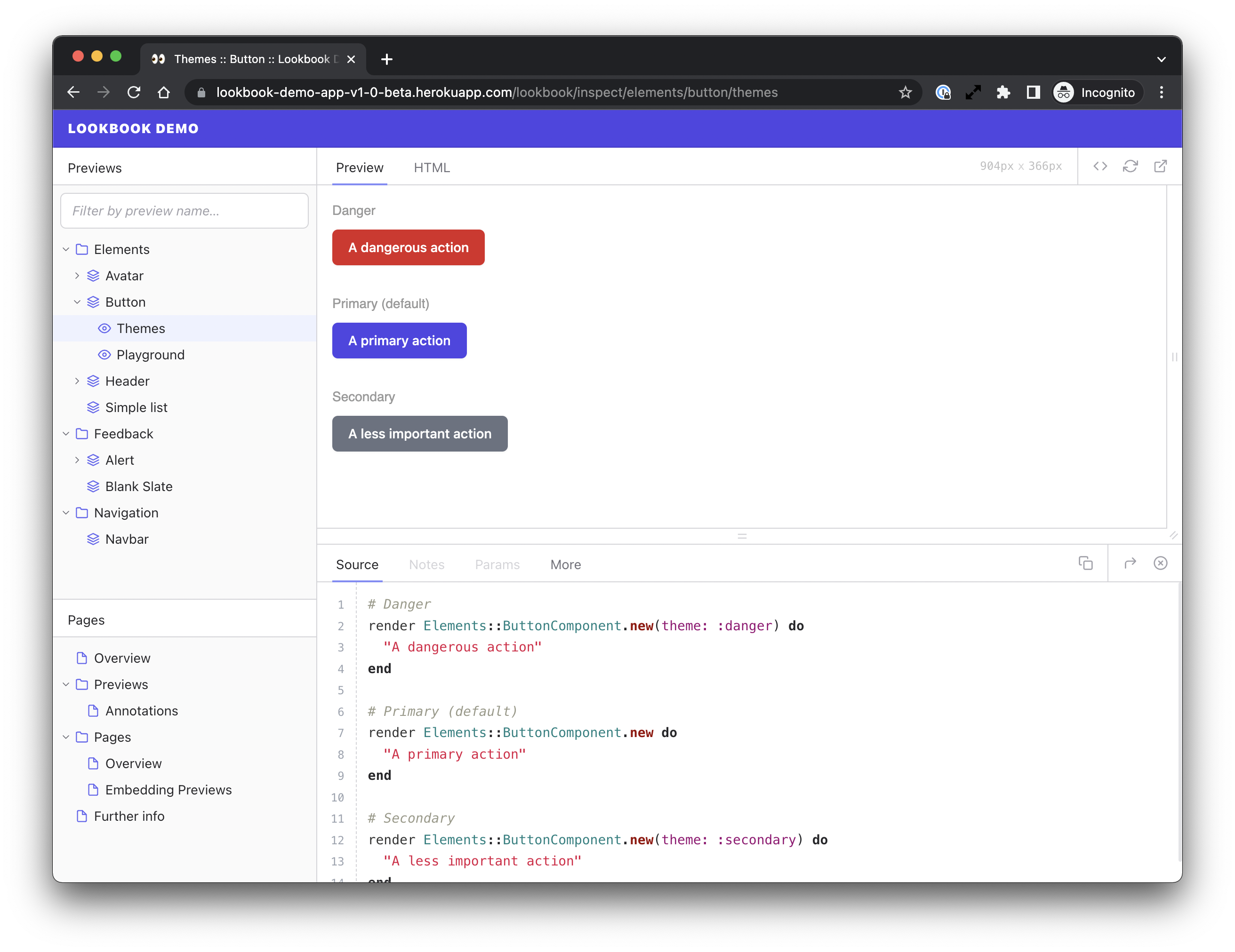
Lookbook is a tool to help develop, test and document ViewComponents in isolation.
It provides a UI to let you browse your component library and preview your components alongside code samples and documentation.
Lookbook is built on top of ViewComponent’s native preview classes so works out-of-the-box for new and existing projects alike.
This documentation is for Lookbook v1.0+. Documentation for older releases can be found in the 0.9.x branch of the Lookbook repo →

Lookbook v1.0 - Changes and new features
Lookbook v1.0 includes a completely re-written UI, many under-the hood improvements and a some exciting new customisation options.
Frontend changes:
- Completely re-written UI - now built with ViewComponents
- New UI themes and customisation options
- Improved small-screen/mobile view
- Debug menu
- …and many other small visual and usability improvements
New options for extending Lookbook:
- Define custom tags for preview file annotations
- Create your own tab panels - with complete control over content/layout and access to all Lookbook data
- Use lifecycle hooks to run your own code when Lookbook starts up, when files change or at shutdown
Other changes
- ‘Workbench’ app for developing Lookbook’s UI components in Lookbook
- New Rspec-based test suite and dummy app
- All new documentation site (this one!) built using Bridgetown
Lookbook Demo
If you want to have a quick play with Lookbook, the easiest way is to give the demo app a spin. It’s a basic Rails/ViewComponent app with a few test components included to tinker with.
https://lookbook-demo-app.herokuapp.com/lookbook
If you’d rather dig in a bit more and run the demo app locally, the demo repo contains instructions on how to get it up and running.
Who uses Lookbook?
Using Lookbook? Send a pull request to update this list!