Dynamic Params
Lookbook builds on ViewComponent’s dynamic preview values functionality to provide the ability to specify editable preview parameters. These can be changed by the end user in the Lookbook UI in order to customise rendered preview output on the fly, much like the Controls (knobs) addon for Storybook.
- A basic example
- Param tag format
- Input types
- Specifying param options
- Common options
- Default values
- Type casting values
A basic example
We can create a preview with editable text by adding an argument to the preview example method, using the value of that argument when rendering our component
and then adding a @param comment tag to tell Lookbook to generate a form field in the UI so it can be edited:
class HeaderComponentPreview < ViewComponent::Preview
  # @param text
  def default(text: "Some header text")
    render Elements::HeaderComponent.new do
      text
    end
  end
end
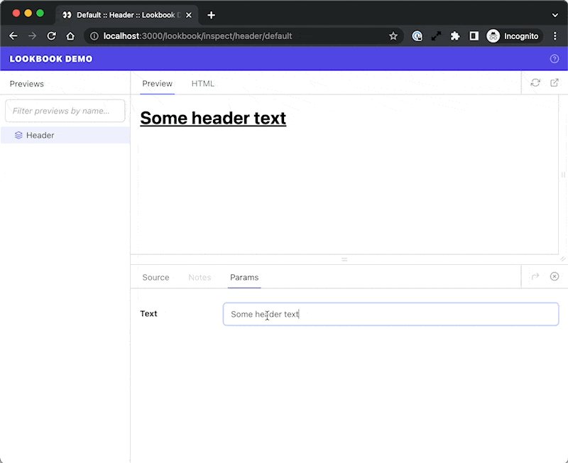
The editable text field will appear under the ‘Params’ tab in the preview inspector. Editing the text in this field will re-render the preview with the new content:
Param tag format
The @param tag takes the following format:
@param <name> <input_type> <opts?>
| <name> | Name of the preview param (should match example method argument key) |
| <input_type> | Input field type to generate in the UI |
| <opts?> | Hash of options for customising field types where supported. |
class ButtonComponentPreview < ViewComponent::Preview
  # @param arrow toggle
  # @param theme select { choices: [primary, secondary, danger] }
  # @param content text #
  def default(content: 'Click me', theme: 'primary', arrow: true)
    render Elements::ButtonComponent.new(theme: theme, arrow: arrow) do
      content
    end
  end
end
Input types
The following input field types are available for use:
📝 Text-style inputs
Single line fields, useful for short strings of text or numbers.
@param <name> text
@param <name> email
@param <name> number
@param <name> url
@param <name> tel
@param <name> date
@param <name> datetime-local
The above types only differ in the validation constraints they impose on the input field.
📝 Textarea
Multi-line textarea field for longer-form content.
@param <name> textarea
📝 Select box
Dropdown select field for selecting from a list of known options.
@param <name> select <options>
| <options> | A Hash of options to pass to the select. The value of the The standard way to define options is as a YAML-formatted hash, but there are other ways to specify options data to help keep things DRY or to reduce the need for hard-coding long lists of option values. See the docs on specifying param options for more detail. |
# Basic options:
# @param theme select { choices: [primary, secondary, danger] }

# With custom labels (each item itself an array of [label, value]):
# @param theme select { choices: [[Primary theme, primary], [Secondary theme, secondary], [Danger theme, danger]] }

# With empty option (`~` in YAML)
# @param theme select { choices: [~, primary, secondary, danger] }
In most cases YAML does not require quoting of strings, however if you are running into issues check out the Ruby YAML docs for a complete syntax reference.
📝 Toggle
On/off switch for toggling boolean values.
@param <name> toggle
Specifying param options
Most param field types support customising their look or behaviour using options, allowing you to specify choices for select fields, customise the number of rows in a text field, and so on.
The options hash must always placed at the end of the @param tag annotation, and there are a number or ways to specify or import the properties you need.
YAML-encoded hash
The simplest way to specify options for a param field is to hard-code it as a YAML-formatted hash, as in the case for the list of select options in the example below:
# @param theme select { choices: [primary, secondary, danger] }
This is straightforward and useful for simple cases, but if you have a long list of choices or you want to reference values elsewhere to prevent duplication then hard-coding the data might not be the ideal solution
Importing from a file
It is possible to import YAML/JSON data from a file by providing the file path in place of the YAML-formatted options hash:
# @param theme select data/theme-select-data.yml
# data/theme-select-data.yml
choices:
  - primary
  - secondary
  - danger
Files must have a .json or .yml extension, and by default paths are resolved relative to the application root directory.
However, if the path starts with ./ or ../ then the path will be resolved relative to the current preview file. For example:
# @param theme select ./theme-select-data.json
# @param theme select ../data/theme-select-data.json
This method can be useful if you have a set of data that you want to share between previews, or need non-technical people to be able to edit.
Dynamic param options (since v1.1)
Since v1.1 Lookbook has supported generating options dynamically. That means you can use Ruby code to reference a private method in your preview class, pull options from component class constants, or access data from pretty much anywhere in your app.
If you wish to use this feature you will first need to enable it in the config - it is disabled by default:
config.lookbook.preview_params_options_eval = true
You can then write a Ruby expression within two ‘double-mustache brackets’ in place of the YAML-formatted options. This expression should resolve to a Hash that will be used as the options for the @param definition.
# @param theme select {{ ButtonComponent::THEMES }}
The expressions are evaluated in the context of your preview class, so it’s possible to create a private method that generates the param options and call it directly:
class ButtonComponent::Preview < ViewComponent::Preview
  # @param theme select {{ button_theme_options }}
  def button(theme: :danger)
    # ...
  end

  private

  def button_theme_options
    {
      choices: %i[primary secondary danger],
      include_blank: true
    }
  end
end
Use of eval to evaluate aribtrary strings as code is often frowned upon. However here the only code strings being evaluated are written by those who have access to the preview classes in the codebase. No user-inputed data is ever eval‘d.
Common options
Some options are supported across all @param field types:
| label | Customise the field label |
| hint | Add a short text hint about how the field should be used. Displayed as a tooltip when hovering over a ‘?’ icon next to the label. |
# @param call_to_action text { label: "Button text", hint: "The text that is rendered in the button" }
def button(call_to_action: "Click me")
  # ...
end
Default values
Default values are specified as part of the preview example method parameters in the usual Ruby way:
def button(content: 'Click me', theme: 'primary', arrow: false)
  # ...
end
These will be used as the default values for the param fields.
Note that the default values are not evaluated at runtime, so you cannot use method calls to generate the defaults. Only static default values are supported.
Type casting values
Most dynamic param values are passed to the example method as strings, with the following exceptions:
toggleinput - values are cast to booleansnumberinput - values are cast to integers
In some cases, you may want to type cast the parameter value to something else (for example a Symbol) before using it when initializing the component.
To help with this, a type option can be specified in the @param definition to automatically cast the dynamic value to a different type:
# @param <name> [<type>] <input_type> <opts?>
In the example below, the value of the theme param (by default a string) will be automatically cast to a Symbol, ready for use in instantiating the component.
# @param theme [Symbol] select [primary, secondary, danger]
def default(theme: :primary)
  render Elements::ButtonComponent.new(theme: theme) do
    'Click me'
  end
end
The supported types to cast to are:
String- default for all excepttoggleinputsBoolean- default fortoggleinputsSymbolDateDateTimeIntegerFloat
The following structured types are also available but should be considered experimental - you may run into bugs!
Hash- value string converted to Hash using the Ruby YAML parserArray- value string converted to Array using the Ruby YAML parser