Previews Overview
You don’t need to do anything special to see your ViewComponent previews in Lookbook - just create them as normal and they’ll automatically appear in the Lookbook UI.
Preview templates, custom layouts and even bespoke preview controllers should all work as you would expect if you were using the standard ViewComponent preview system.
If you are new to ViewComponent development you should first read the ViewComponent docs on creating previews as Lookbook uses these same files.
Terminology
Within this documentation ‘preview’ will be used to refer to the entire preview class (which is usually dedicated to previewing a specific component) and ‘preview example’ (or just ‘example’) for an individual method within that preview class.
One preview will always have one or more examples.
# Preview: 'Button'
class ButtonComponentPreview < ViewComponent::Preview

  # Preview example: 'Basic Button'
  def basic_button
    render ButtonComponent.new do
      "Click me"
    end
  end

  # Preview example: 'Fancy Button'
  def fancy_button
    render ButtonComponent.new fancy: true do
      "Touch me"
    end
  end
end
Inspecting previews
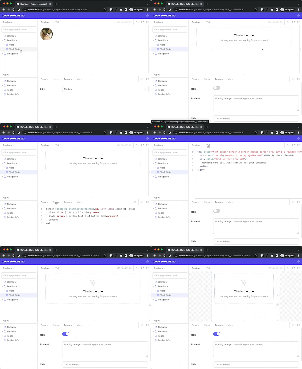
Previews are displayed in the preview inspector where you can see the rendered component preview, as well as inspect the HTML output, see the preview example source code and more.
The preview window can also be resized to make testing responsive components a snap.

You can browse some example component previews in the Lookbook demo →
Annotating preview files
Lookbook extends the standard ViewComponent preview classes using Yard-style comment annotations in the source code.
These are just structured comments that are read by Lookbook and used to provide additional customisation and functionality when rendering previews.
Using annotations you can customise the name of previews in the navigation, group two or more preview examples together into a single preview, add implementation notes and much more.