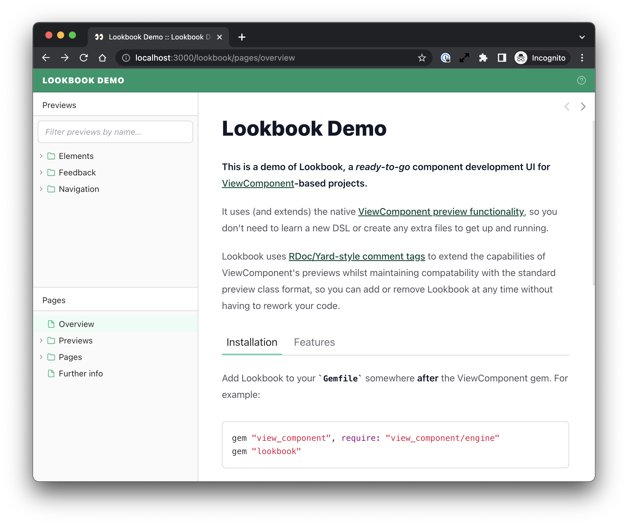
Theme Customisation
It is possible to further customise your chosen base theme by overriding some (or all) of the color variables values used in the themes.
You can do this using the ui_theme_overrides config option:
# config/application.rb
config.lookbook.ui_theme_overrides = {
  header_bg: "#ff69b4", # hotpink
  nav_icon_stroke: "rebeccapurple"
}
Available color variables
The following variables can be overridden in your application config:
| text | Base text color |
| divider | Base divider (line) color |
| header_bg | Header background color |
| header_text | Header text color |
| header_border | Header bottom border color |
| branding_text | Project name text color (defaults to value of |
| sidebar_bg | Sidebar background color |
| page_bg | Page background color |
| drawer_bg | Preview inspector drawer background color |
| icon_button_stroke | Icon button stroke color |
| icon_button_stroke_hover | Icon button stroke color on hover |
| tooltip_bg | Tooltip background color |
| tooltip_text | Tooltip text color |
| scrollbar | Scrollbar background color |
| scrollbar_hover | Scrollbar background color on hover |
| toolbar_bg | Toolbar background color |
| toolbar_divider | Toolbar divider color (defaults to value of |
| tabs_text | Tabs text color |
| tabs_text_hover | Tabs text color on hover |
| tabs_text_disabled | Disabled tabs text color |
| tabs_border_active | Bottom border color for active tabs |
| nav_text | Navigation text color |
| nav_toggle | Navigation toggle (arrow) color |
| nav_icon_stroke | Navigation icon stroke color |
| nav_item_hover | Navigation item background color on hover |
| nav_item_active | Navigation item background color when active |
| input_bg | Form input background color |
| input_border | Form input border color |
| input_border_focus | Form input border color on focus |
| input_text | Form input text color |
| input_text_placeholder | Form input placeholder text color |
| input_toggle | 'Toggle' input background color |
| input_toggle_active | 'Toggle' input background color when active |
| prose_bg | Prose area background color |
| prose_text | Prose area text color |
| prose_link | Prose area link color |
| viewport_handle | Viewport resize handle background color |
| viewport_handle_icon_stroke | Viewport resize handle icon stroke color |
| viewport_handle_icon_stroke_hover | Viewport resize handle icon stroke color on hover |
| favicon | Favicon color |
| favicon_dark_mode | Favicon color for dark mode only |
| favicon_light_mode | Favicon color for light mode only |
Using color scales
Alternatively, you can supply base & accent colour scales and Lookbook will attempt to use the most appropriate shade for each piece of UI.
The Tailwind website has a great color scale reference and the majority of color scales defined there will work well with the Lookbook theme system.
To use color scales, you will need to override the color value for each shade in the scale:
# Emerald colour scheme (https://tailwindcss.com/docs/customizing-colors#:~:text=%2314532d-,Emerald,-50)
config.lookbook.ui_theme_overrides = {
  accent_50: "#ecfdf5",
  accent_100: "#d1fae5",
  accent_200: "#a7f3d0",
  accent_300: "#6ee7b7",
  accent_400: "#34d399",
  accent_500: "#10b981",
  accent_600: "#059669",
  accent_700: "#047857",
  accent_800: "#065f46",
  accent_900: "#064e3b",
}

If you are happy with the base color scale, there is no need to redefine it - the default gray scale should work well for most themes.
And you can always override a specific color variable too once you have defined your own scale:
# Emerald colour scheme (https://tailwindcss.com/docs/customizing-colors#:~:text=%2314532d-,Emerald,-50)
config.lookbook.ui_theme_overrides = {
  accent_50: "#ecfdf5",
  # ... other color scale colors ...

  header_bg: "red", # and then override a specific color variable
}
Color scale variables
| accent-50 | Lightest accent color shade |
| accent-100 | … |
| accent-200 | … |
| accent-300 | … |
| accent-400 | … |
| accent-500 | … |
| accent-600 | … |
| accent-700 | … |
| accent-800 | … |
| accent-900 | Darkest accent colour shade |
| base-50 | Lightest base color shade |
| base-100 | … |
| base-200 | … |
| base-300 | … |
| base-400 | … |
| base-500 | … |
| base-600 | … |
| base-700 | … |
| base-800 | … |
| base-900 | Darkest base colour shade |
Themes often work best when the base colour is a type of gray, with the accent a brighter, more vibrant color.